international reviews
IllumINATIONS - The 54th Venice Biennale
Various Artists at Various venues around Venice
By Sue Williamson04 June - 27 November. 0 Comment(s)
Bice Curiger
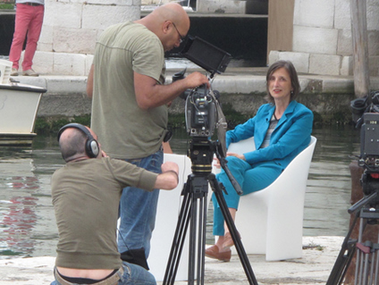
Biennale director Bice Curiger faces the press in Venice,
.
2011
.
Swiss curator Bice Curiger received the news that she had been awarded the directorship of the 54th Venice Biennale in March 2010, giving her effectively 14 months to come up with a theme, try to put in place some innovations which would put her stamp on this Biennale as against previous editions, travel the world looking for the best and most brilliant artworks to fit into her chosen theme, however loosely, commission some new work, organize the catalogue and the writers, negotiate all of this with the Venetian powers that be (not to mention countless artists, national departments of culture, collectors, gallerists and institutions), and finally bring all of the artwork to Venice and get it installed, lit and in full working order by June 1, 2011, the first day of the previews.
art events calendar
VIEW FULL CALENDAR
buy art prints
edition of 60: R7,500.00
About Editions for ArtThrob
Outstanding prints by top South African artists. Your chance to purchase SA art at affordable prices.
FIND OUT MORE Editions for artthrob
Most single museum shows are much longer in the planning than 14 months, and one might ask here - before going into the question of the ways in which Curiger’s Biennale succeeded or did nor succeed - whether it is reasonable to ask of any one person to bring all this together coherently in such a short time, no matter how skilled and resourceful she is, no matter how good her back up team is. This is a question which the organizing committee of La Biennale de Venezia should be debating right now before the 55th edition is upon us, in 23 months’ time.
By August of last year, Curiger had come up with the theme of IllumINATIONS, or IllumINAZIONI, a workable play on words which seemed to suggest that in an age of globalization, the artists of the world could throw light upon the commonalities that unite the human race, in spite of the incomprehensible behaviour of other nations which fills the pages of the world’s press.
Although Curiger was quoted in the journal Modern Painters (May 2011) as saying that in the age of the digital image, painting was dead, one of her innovations was to choose three masterpieces from the past to be the first to greet the viewer in the large gallery which leads from the entrance of the Padiglione Centrale, the pavilion which holds the international exhibition curated by the director.
These were three paintings by the Venetian Rennaissance artist Tintoretto, noted for his extreme use of shafts of light to add high drama to his paintings, his ability to play with perspective, his readiness to paint the human body fast and experimentally.
This was an interesting premise for a contemporary art survey. Whether the Tintorettos do indeed bear a relationship to the work in the rest of the pavilion, is necessarily true in varying measure, (Maurizio Cattelan’s stuffed pigeons, gazing down from the rafters at the viewers as they stared at the paintings, introduce a note of healthy skepticism) but the concept set a starting point.
Perhaps the work most directly descended from the Tintorettos is Pilpilotti Rist’s reworking of three historical engravings of Venice in which the city scenes are flooded with rapidly shifting light and colour with added skyscapes of hands and bodies engaged in artistic pursuits. These scenes were somewhat uncomfortably contained by gold frames, and one wished as in previous Rist works, the images had been allowed to flood the walls and suffuse the entire space with luminous colour.
Cindy Sherman, on the other hand, has allowed her earnest American matrons to step down from their frames and occupy a wall space flanking mirrored Arcadian scenes in black and white, setting up an unbridgeable distance between the women and the land in one of the strongest works of the pavilion.
Another of Curiger’s innovations was to invite four artists to create ‘para-pavilions’, in which other artists’ works would be enclosed. In the Padiglione Centrale, the Polish artist Monika Sosnowska created a star-shaped structure, cladding the outer walls with a Venetian-type wallpaper. The inner surfaces of the points of the star were the exhibition spaces allocated to photographer David Goldblatt, who arrived in Venice to discover that his work had to be installed on the steel structures supporting the drywalling of the installation.
Asked to comment on his reaction to this situation, Goldblatt has responded to ArtThrob: ‘Regarding the space "created" by Sosnowska within which I exhibited my work at the Venice Bienale: I am told that this 'para-pavilion', consisting of an irregular star-shaped structure within a hall of about 20x25 metres, is an attempt to 'deconstruct the white cube'. In this it succeeded admirably - so much so that it has effectively deconstructed most of the usable exhibition space within the cube.
‘I won't comment on Sosnowska's structure as a 'work' in itself. Suffice to say that as a 'place' within which to exhibit work such as mine, I suggest that it was designed not to be used. It is highly impractical, the spaces are bitty and no thought whatever has been given to providing surfaces on which to exhibit the work other than on vestigial walls of the original cube. But for some innovative tinkering on the part of the crew that hung my prints we would not have been able to show a substantial part of the exhibition. I was not consulted about the design of the space I was allocated.’
One might surmise that it is when time runs out on curators that consultations which one would imagine were essential do not take place.
Goldblatt shows two bodies of work – the most compelling series being black and white portraits of South Africans convicted of a crime, taken at the place at which that crime was committed. Text beneath the photographs describe the circumstances of the crime, circumstances which are clearly linked to a second series of works: aerial photographs showing the tightly packed shoebox houses of Johannesburg’s black townships. As always though, Goldblatt’s remarkable photographs are presented without editorial comment beyond the bare description.
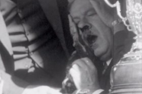
In the Arsenale, work not-to-be missed would include Nicholas Hlobo’s extraordinary Iimpundulu Zonke Ziyandilandela, a mythological dragon of a rainbird with an umbilical cord of a tail. Christian Marclay’s Golden-Lion-winning The Clock is a 24 hour opus. To the second. The artist came up with the brilliant concept of trawling old movies for scenes involving watches and clocks and setting these scenes precisely to match real time, giving the viewer a startling sense of actually being present in the movie, even if off camera.
Another favourite time-based work was Urs Fischer’s three candles, one a figure of a casually suited man. The wick which emerges from the top of his head was lit on the first day of the previews and by day three, when this photo was taken, his skull was already hollowing out and locks of wax streamed down his face.
Still looking at how artists incorporate a sense of time into their work, press the OPEN button and step into Gigi Scaria’s elevator in the Indian Pavilion (in the Arsenale), to take a journey through the sub-continent. The back and sides of the elevator carry rear screen projections which convince one that one is whizzing from floor to floor, stopping each time at a new interior, ranging from palatial to humble. The illusion is perfect.
And now I will have to speed up if I am to finish this review in time and within a reasonable word quota. The German pavilion, with GERMANIA altered into EGOMANIA, won a posthumous Golden Lion for Christoph Schlingensief, who died last year. It’s a red lit cathedral of objects, competing film projections, weird voices and a confessional chair, all in the name of artistic dissidence. Do not miss Christian Boltanski’s baby factory in the French pavilion, a factory whose scarily fast production can be brought to halt by pressing a button.
An encounter with roadside children selling crystals was the original inspiration for Thomas Hirschorn’s Crystal of Resistance at the Swiss Pavilion, which utilizes millions of miles of sticky tape to adhere crystals to plastic chairs heaped with cell phones and hundreds of other objects – it’s a strange glittering grotto. Outside the American pavilion, an Olympic athlete runs on a treadmill on an upturned tank in a piece devised by Jennifer Allora and Guillermo Calzadilla with more visual quips inside.
At the Palazzo Bembo, on ‘Personal Structures’, Andrew Putter’s Secretly I Will Love You More – in which a portrait of a colonial-era Dutch woman sings a gentle song in the click language of the San – is holding its own against work by such artists at Marina Abramovic and Joseph Kosuth.
My own favourite show was ‘Penelope’s Labours’, on St Giorgio island, which showed gorgeous large scale contemporary tapestries by such artists as Lara Baladi, Marc Quinn, Craigie Horsfield and Carlos Garacoia. Take the ferry from San Zaccario.
And finally, the South African pavilion features Siemon Allen, Mary Sibande and Lyndi Sales in an exhibition called ’Desire’, curated by Thembinkosi Goniwe. This is the first time South Africa has had their own pavilion under the auspices of the central Biennale committee since 1993. There is a big handsome catalogue and the exhibition has been generally well received. It will be reviewed in depth in a later edition of ArtThrob.