Archive: Issue No. 48, August 2001

| ||||||||||||||||
|
|
Cape 28.08.01 Bridget Baker's 'Official BB Project' at the US Art Gallery 28.08.01 Greta Matthews - 'Birdsong' at the AVA 21.08.01 Bonita Alice at Bell-Roberts Art Gallery 21.08.01 Kevin Brand at the AVA 07.08.01 'Myself.write Mycode' at Bell-Roberts Art Gallery 31.07.01 Andrew Porter and Michael Pettit at the AVA Gauteng 28.08.01 Max Ernst at the Johannesburg Art Gallery 28.08.01 Gwen van Embden at Art on Paper 21.08.01 Mara Verna at the Jan Smuts Ave/Bolton Rd intersection 21.08.01 Willem Boshoff at RAU and Millennium II 31.07.01 New Contemporaries, New Signatures and the Martienssen 24.07.01 Absa Atelier Art Awards 2001 KwaZulu-Natal 14.08.01 FNB Vita Art Prize 2001 at the NSA Gallery International 31.07.01 Siemon Allen at the Corcoran, Washington 24.07.01 The 49th Venice Biennale 24.07.01 'Authentic/Ex-centric' - praise from the world press 17.07.01 'Authentic/Ex-centric' at the Venice Biennale 17.07.01 William Kentridge retrospective tour in the US Publications 28.08.01 Taxi-003 Jeremy Wafer
| ||||

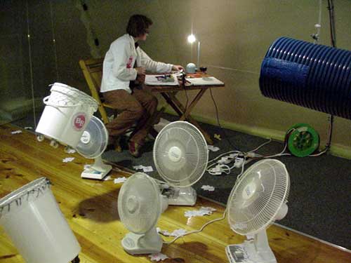
Bridget Baker harvests leaves
The artist in Kwikkleen Dry Cleaners
The leaf stamping process
Baker in the kite-making chamber
Duelling fans (click on image to watch MPEG movie)
|
Bridget Baker's 'Official BB Project' at the US Art Gallery
Stellenbosch is famous for its oaks, and when Bridget Baker arrived in May this year to take up an invitation from the University of Stellenbosch's Fine Art Department to plan an exhibition in their gallery, the autumn leaves had already started to fall.
Baker had come to live in the town for three months, with no pre-set ideas of what she would do for her exhibition, but knowing she did not want to make studio work. "I wanted to explore the artmaking process as a communal act. How does a community of passersby (and not the art elite) respond to the diverse ways of making art by making it in a public space?"
Those falling leaves ... "They, as well as the community's industrious involvement in disposing of the leaves, fascinated me. Seemingly conventional activities used in the process of disposal, such as raking, sucking, blowing and vacuuming, form part of the harvesting of the dead leaves." Conceptually, Baker chose to link these leaves with a second symbol of a hard-working society - falling ATM slips.
Setting herself up in the window of Kwikkleen Dry Cleaners, Baker punched oak leaf shapes from these slips, harvested from banks around the town, and invited members of the public to get involved by signing them. "By sitting in the window, I met a thief (he signed a leaf), met the 'town's child' (a homeless boy who seems to know and like everyone in the town), bank managers, the people who offload at Shoprite next to Kwikkleen. I got what I wanted out of my time here, without a doubt. It is a very small place, Stellenbosch, and people find out who you are really quickly. They also let you know that they know what you're up to."
On the opening night of the exhibition at the US Art Gallery in Dorp Street last week, it was the art-going public that was invited to take part in Baker's leaf project. A plastic hydroponic tunnel filled the part of the gallery which was once an old church. In the rear section of this, a team of volunteers busily took visitors through the process of stamping out, signing, numbering and tagging a leaf. A partition divided this space from the rest of the tunnel, but through the partition wall protruded a nozzle with a switch. Completed leaves held to the nozzle - which turned out to be a leaf sucker - were transported to the next space, a space the owner of the leaf was now permitted to enter. Here, BB herself sat in her white overalls, still hard at work at a small table. Buckets hung from the roof of the tunnel at crazy angles, ready to receive the leaves being blown through from the adjacent space. Should one's leaf fall into the correct bucket, the artist would make a "kite" out of it, attaching a long tail. All kites hung against the wall in an adjacent room.
In yet another room was a small piece consisting of two electric fans with their blades replaced by rods with twists of leaves at the end. Facing each other, they engaged in an endless duelling match, remniscent of the motorised vases of flowers which collided with each other at Baker's last public appearance on 'Holland South Africa Line' (see ArtThrob Reviews January 2001).
At that time, having just spent six months in Germany and Holland, Baker said she had missed the chaos which is an intrinsic part of life in South Africa. Her art processes are a stimulating expression of this chaos. On one hand, there is an attempt to impose a kind of wacky order through a strict set of rules, and on the other to induce a large number of people to play along. In this way, Baker introduces her audience to the idea of art as an enjoyable, if unforeseeable, part of everyday life, None of this would work as well and as satisfactorily as it does if Baker did not pay the closest attention to every detail of her project, from the specially designed BB logo to all the other numbering and stamping processes which replicate the most annoying side of being a good citizen and doing what one has to do to achieve what one wishes.
To quote Baker's press release: "'The Official BB Project' explores the nature of the artmaking process as inclusive/exclusive: randomness, taking chances, voting, playing the lotto, applications to art schools, change, success and failure."
If you missed the fun of the opening night, you can still see the after-the-party residue in the form of leaves, kites, videos, duelling fans and other detritus. But next time BB puts on an event, don't miss out.
Until September 12
US Art Gallery, corner of Dorp and Bird Streets, Stellenbosch
| ||||

Greta Matthews
Greta Matthews
Greta Matthews |
Greta Matthews at the AVA
by Paul Edmunds If you were to speak to me in Inuit I wouldn't know what you were saying, but that wouldn't stop me from seeking out familiar landmarks in your language. This is often the case with abstract or non-figurative painting. Since the time of Kandinsky, artists have sought out a universal language, one that transcends spoken words and cultural specifics. Viewers have not always been able to speak this language, certainly not consciously, but it hasn't stopped us trying. Greta Matthews treads this well-worn path, and she does so very elegantly. As a viewer, I tread my familiar path, seeking colours with symbolic value, forms that remind me of others, and the familiar constructs of illusionistic space. 'Birdsong', as the show is called, consists of works "which exist outside of language", according to Matthews, but attempts at decoding them are nonetheless rewarding. For the Purpose of Shade I and II are a case in point. The two horizontal works each consist of an agitated plane of matte beige, pierced by window-like apertures. The shapes and compositions recall Robert Motherwell's 'Spanish Elegy' series. The holes reveal a layered and textured vista in cool greens and blues, evoking a landscape. The shapes of the apertures and the colour of their surrounds recall eye sockets through which a landscape is glimpsed. I can't stop thinking of the distorted skull in a still life by Jakob Holstein, symbolising mortality and impermanence. Mouth to Mouth I-IX is a series of canvasses half the size of an A4 sheet. They are covered in thick oil and encaustic in a range of gray-blues and maroon. Curtains of opaque encaustic move aside to reveal other parts, less heavily painted, where images struggle to come into being. In VII a maroon line begins to set up the illusion of a painted construction, whose position in space seems to be confirmed by a shadow - or is it? Matthews creates works that successfully straddle the line between contrived arty flourishes and successful accidents. Perhaps this is the language to which she refers, arising subconsciously, saturating a viewer with an elusive satisfaction. Widowed Voices I-IV similarly carry with them a promise that is never revealed and a loneliness which is never explained. The paintings consist of flat planes of Matthews' matte beige, and other parts which allude again to landscape without depicting it. In the first work in the series, some lighter toned lines begin to describe a volume which is neither animal nor vegetable. This motif recurs throughout the series, once as if in extreme close-up. This is quite unsettling as Matthews still manages not to overtly depict space. The series has a sense of movement, even a narrative, and in this way invokes an element of time. On one of the short walls of the Long Gallery a grid of postcard sized Collages invites closer inspection. Each is framed in a dovetailed plywood box and is detailed to the extreme. Old postcards, maps, images of birds and carefully tied cotton threads provide plenty of food for the eye, until now starved of the figurative and familiar. Migrating geese, swallows, two hands reaching across the span of the work, evoke travel, distance and migration. Given that Matthews has been living in foreign countries for the past two years, and the edgy, non-referential territory of her other work, perhaps these express a yearning or sense of dislocation, with their intimate scale and precious object-like quality. Matthews says: "We are as birds in that we speak languages which we don't always understand", and while this sounds a little contrived, the satisfaction I experienced makes it true to some degree. There is no denying that this show is aesthetically very considered, but its formal solidity and consistent vocabulary provide enough to justify what some might consider an excursion to nowhere. Closing: September 1
Association for Visual Arts, 35 Church Street, Cape Town
| ||||

Bonita Alice
Bonita Alice
Bonita Alice
Bonita Alice |
'Giving and Not Giving' - Bonita Alice at Bell-Roberts Art Gallery
by Paul Edmunds To begin by noting that this exhibition includes a transcript of an interview the artist conducted with the head groundsman of Ellis Park stadium might suggest that it is a bit tedious. But this appears to be Bonita Alice's device: she draws from the mundane and prosaic an obscure yet elegant statement about people and their connection to their cultural and geographical roots. At best this is poignant and intriguing; at other times it is impenetrable and unconvincing. Alice uses the traditional media of oil painting and woodcarving as well as documentation of painted images she created on a sportsfield. The theme of "turf" pervades the show. Literally the word refers to grass and sods, metaphorically to one's sense of place and roots. In her sculptures consisting of both carved and found elements, the schematised image of a patch of grass recurs. Obviously indebted to her one-time teacher Peter Schütz, these simplified forms are charming but it's unclear whether they invoke the meaning they purport to. Growing from prefabricated wooden bases, the tufts support bowls on top of which are piles of filleted fish, some modestly cast in a dull aluminium, as in Giving II. A large untitled work takes this motif and blows it up to the scale of furniture. Sustenance it promises, but there is always the possibility of rot, the pearlescent painted wood being as feverish as it is attractive. The paintings consist mostly of still lifes depicting a topography of containers holding an indeterminate white substance. Sustenance is played off against opulence in small scenes which assume the stature of landscapes. In Still Life I-VI, heart-shaped bowls containing some sort of flesh are arranged on a table's surface. Glimpses of woods, fields and clearly European vistas form the background to the table-top tableaux. Alice makes reference to specific places in works such as Ladle and St Sophia Cathedral, Kiev. Here an unusually angled soup ladle is set off against an image of, one assumes, the above-mentioned cathedral. Alice departs from traditional media to produce Turf, which is presented here in the form of a large photographic triptych as well as video documentation. Working with a sign company that specialises in reproducing corporate logos on sportsfields for television, she designed the simple motifs which depict sheets of corrugated iron. The first is flat and rectangular, the next wrapped like a rain tank and another is bent along its corrugations. These, by "anamorphic perspectival distortion", appear three-dimensional and on the same plane as the camera. They also look suspended above the field, the illusion completed by "shadows" painted some distance away. The work is site-specific, placed on the fields of Barnato Park High School in Berea, Johannesburg, where the artist's forebears attended school. The sheets of iron make reference to cheap and impermanent building materials, characteristic of informal housing. In the show's attractive catalogue, Alice discusses the inevitably temporary claim that people make on the place where they live, and in this light the work ruminates on the passing of this claim for her family who have since died or moved away. Without the writing, however, I doubt I would have got there. Alice's competence in woodcarving and oil painting is satisfying. The images she chooses are for the most part accessible and the area she explores is relevant in a land of settlers and dispossessed. Her use of symbols sometimes stretches to reach the ideas discussed in the abundant writing on the exhibition's walls and catalogue. The technique she employed to produce Turf is original but, together with the shaky video documentary, appears as a formal device which took the first opportunity that suggested itself. This makes for an immediately impressive work, but one whose impact is not sustained.
Opening: Wednesday August 15 at 6.30pm
Bell-Roberts Art Gallery, 199 Loop Street, Cape Town
| ||||

Kevin Brand
|
Kevin Brand at the AVA
Trained as a sculptor, yet often working with paint, Kevin Brand has an interesting way of making work that hovers between the two disciplines. His two-dimensional images are arrived at through an exact process, planned beforehand, and his paint is applied sparingly and reductively to describe a form rather than in any surrender to the richness of colour.
Take the new paintings in his Observer series on his exhibition 'Something Old, Something New', currently on view at the Association for Visual Arts, Cape Town. Using a process which artists from the Renaissance onwards have employed to enlarge small images into much bigger ones, Brand has "gridded up" black and white photographs of faces which have appeared in the press, and in place of reproducing exactly what was in the small square has simply chosen the predominant tone of grey in that square for his large portrait. Lest one think such a process makes the hand of the artist unnecessary, Brand admits to altering these configurations if his eye seemed to call for it. Thus each portrait, spread over rather a casually drawn grid on an old board (filched from Willie Bester, the supremo of collected junk), is a mosaic of tonal values. So large are the squares, viewers are seen narrowing their eyes slightly in an attempt to bring the facial features into focus.
Rather beautiful as simple areas of monochromatic squares painted on wood, it is the difficulty to which Brand subjects us in transcribing the facial features of each portrait which give the works a conceptual edge. Brand chose his pictures from newspapers from around the country, one on the occasion of each birthday he has celebrated since the watermark year of 1994. He has said that he selected the images randomly. The faces may have been in the newspapers, seven years may have passed since the coming of democracy, but for most South Africans, the lives and feelings of their fellow citizens have still not come fully into view.
Using the same technique of gridding up, Brand's piece for the 2000 Havana Biennale, here on public view for the first time, reproduced Breughel's famous painting of the Tower of Babel, with its underlying theme of a breakdown in communication. Here, Brand used squares with designs of letters and vacuum-formed plastic to make up his grid, painting on the greys, whites and blacks from the back. Regrettably, the visual connection with the original painting is hard to make. A reproduction of the source material might increase the audience's understanding and appreciation of the work.
Brand has also used his pixel technique to make large-scale public drawings - the first of which imaged the famous photo of Hector Peterson, the first youth shot in Soweto in 1976, which appeared on the walls of the Cape Town Castle on the exhibition 'Faultlines' in 1995. A photograph of this is on show. Upstairs at the AVA, in Denel and Defending Arcadia, small circular pieces of lead stamped with the national flag recall the top of limpet mines. These circles are buried in large corrugated cutouts of children missing limbs.
Brand manages to combine his innovative and surprising use of material with an acute social consciousness mediated with artistic integrity: his work is a highly successful synthesis of his concerns.
Greta Matthews is showing concurrently in the Long Gallery at the AVA. A review of her work will appear next week.
Until September 1
Association for Visual Arts, 35 Church Street, Cape Town
| ||||

Peet Pienaar against a background of packaged viruses
Inside the envelopes
'Myself.write Mycode'
|
'Myself.write Mycode': Cyber crime at Bell-Roberts Art Gallery
Talk about timing. In the very week that the fearful danger of the Code Red virus infecting computers across the world hit global headlines, Peet Pienaar and his co-conspirators launch a virus contained on a CD which can be bought as an art object (price: R50) in an envelope decorated with warning crosses and notice. This notice tells you it is a criminal offence to convert the code into an active .vbs and release it, and informs the buyer that "all the information and files contained on this interactive CD-Rom are for art purposes only". Make no mistake, the virus is not just an art joke - it is real.
"We have imported the virus into sound and repeated it," explains Pienaar at the opening of the five-day exhibition at Bell-Roberts Art Gallery. "When you download it onto your computer it changes everything on your hard drive into the virus itself. If you try to delete it, it replicates itself and sends itself to everyone on your email list and then as soon as they open it the same thing happens. Within five hours 70 000 computers would be infected." Right, then. There is an upside - having demolished everything you ever entrusted to your computer, the virus will leave you a final message, which it will also post to major ad agency Ogilvy and Mather's noticeboard: Get a job in advertising.
The metaphor is clear: advertising and its insinuation into every aspect of our daily lives, its continual suggestion that if only we bought this, or drank that, our lives would improve in quantifiable and also magical ways is as lethal and all pervading as a computer virus. And 'Myself.write Mycode' also reveals the sophisticated and complex planning that goes behind the merry messages that clog the media. To launch their virus, Pienaar and co-workers Heidi Petersen, Stacy Hardy, Dror Eyal and Gareth Chisholm have set the gallery up as a war chamber. On the longest wall, a sheet of paper is covered with diagrams in charcoal, annotated with many coloured mapping pins which remind one of an old World War II movie. Type on red boards sets out the various aspects to be considered in planning the attack: Target Market, How We Reach Them, etc. It is the group's thorough understanding of exactly what all these mechanisms are and how they operate that makes this particular exercise so successful.
Pienaar, initially known as a performance artist questioning the constructs of masculinity, has, since his stint at the Jupiter Drawing Room as "Creative Stimulator", extended his artistic concerns to consider the effects on society of branding and marketing, and in one of his more famous exercises attempted to advertise his shorn foreskin for sale on the www (legal restrictions prevented this). The kind of intellectual exercise which 'Myself.write Mycode' provides for viewers has become typical of Pienaar (see his Artbio in the ArtThrob archives). The structure underlying his concepts combined with his sense of anarchy and creative boldness make him one of the more interesting artists around.
The show is only up for this week. Catch it. But not the virus.
August 5 - 9 only
Bell-Roberts Art Gallery, 199 Loop Street, Cape Town
| ||||

Andrew Porter
Michael Pettit
Michael Pettit
|
Andrew Porter and Michael Pettit at the AVA
by Paul Edmunds Andrew Porter and Michael Pettit are strange bedfellows. Despite this, their exhibitions are uncannily complementary. Porter's work contains the elements of a joke but not the punchline; Pettit's offers only the punchline. While Porter goes some way towards enticing the viewer to complete the gag, I found myself unmoved to match Pettit's punchlines to an appropriate story. Both left me wanting more - in Porter's case, more paintings, more layers; Pettit I wanted to disrupt the uniform surfaces, disturb the regular weave of his canvas. Visits to Porter's studio and pieces on the 'Bloedlyn', 'Soft Serve' and 'Ubododa' shows had left me wanting to see more of his work. Great potential seemed to exist somewhere between his formal virtue and improvised flourishes. But I was sadly disappointed with 'So I said to him, well, if you're not prepared to do it, then someone else can ... you know, I knew he wasn't the one for the job, show, or are we all artists', as his exhibition is eccentrically titled. Eight paintings in all, the show seems a little insubstantial, and from the outset is very difficult to grasp. Like the title, the paintings are a bit odd. Strangely shaped canvasses are covered with images and gestures in any number of styles. The three Kwerty paintings (referring to the Qwerty keyboard configuration?) consist of square stretchers pierced by square openings in their centres. Each is divided in half and painted in complementary blue/green and orange/yellow scumbles. Beneath this, "kwerty" and other partial words and phrases are lightly brushed in. These are laid down on a ground of complex, irregular forms, mirrored on the opposite side of the work. These shapes suggest paint accidents as much as Chinese characters. One never quite pins them down or figures out the rules that determine their form. The four Sign of the Times works are shaped like the above-mentioned glyphs. With their promontories, inlets, limbs and apertures, they are difficult to describe - the only comparison that comes to mind is the marks left on a wall after double-sided tape has lifted a layer of paint. Sign of the times - 3 birds has a chamber described by lines that recall Islamic tiling in the centre, and towards the outside, on three narrow peninsulas, faithfully rendered images of finches. Although the piece is attractive and its draftsmanship impressive, the images fail to establish any connection with each other. In Sign of the times - Is this some kind of joke? a similarly shaped canvas is marked by a coffee stain and texts which are clearly lines from jokes. Alas, no punchline, and a similar dearth of paint. To Porter's credit, one somehow trusts that the works make some kind of sense, one just isn't able to locate it. It is equally hard to take Pettit's jokes seriously - somehow I feel I would like his work more if it appeared alongside a story in The New Yorker. These are not bad paintings, but often they seem to be one-liners and fail to engage convincingly with the formal language of large-scale painting. The titles impose finite limits on the canvas, disallowing the images to grow. Surfaces, even when they appear gestural, are seldom daring. Line quality is consistently easy and illusionistic shadow is largely uniform and tastefully dramatic. At first glance, the four works Wing, Tent, Lake and Night appeal. The large black shapes invite contemplation. The central image in Wing seems to be derived from an opened fan, and that in Night from an open book. These are placed on a background of obscure forms rendered in light pastels. Unfortunately, on this scale, the shapes are too simplistic, the edges too regimented. The symmetry of the forms is perhaps the most interesting idea and recurs throughout the exhibition. Adjacent to these are Portrait(s) of Martin 2, 3, 5 and 6. Here the image of a moth appears, wings opened to reveal striking symmetry. Included in portraits of a near-naked man who emerges from the darkness, dramatically astride a chair, they go no further. Upstairs, a series of four small works offers the most satisfaction. Modest, sensitive and mysterious, their limited palettes of tans and browns with small areas of saturated orange achieve more than any of their large counterparts. Temple depicts a sepia-toned photograph of a cat reflected in a table, surrounded by a crown of meringue-like forms. The title and regal nature of the cat contrast with its playful pose and the irreverence of the surrounding construction. The Orange Gooseberry is a still life of an ashtray depicting a Chinese junk at sunset. Next to the ashtray, two gooseberries in their delicate pods look just like the sail of the junk, but the closest we get to the coloured fruit of the title is the painted sunset. (Next to these works is a large painting entitled Bysantium, in dark greens, blues and maroons, replete with visual conundrums and impossible illusions. Pettit is asking R72 000 for the most grandiose and least successful painting on show, and which is shown up completely by the tiny still lifes to its right.) Pettit's virtuosity with a paintbrush and comfort with any number of styles are almost done a disservice by the sheer quantity of work. And there's still more to see at the Irma Stern! One is left doubting where the artist's loyalty lies, suspecting that this is the work of an illusionist rather than a true magician. Until August 11. Pettit's exhibition at the UCT Irma Stern Museum opens on July 31 and runs till August 18
Association for Visual Arts, 35 Church Street, Cape Town
| ||||

Max Ernst
Max Ernst
Max Ernst
|
Max Ernst at the Johannesburg Art Gallery
Opening without any fuss - hell, not even any press - an exhibition on major 20th century artist Max Ernst slipped into Johannesburg relatively unnoticed. Apparently brought here by the Goethe Institute, there was no explanatory signage, no English translations of the German/French labels and no education programme associated with what could have been an event of note for the struggling Johannesburg Art Gallery.
As I received no press release or invitation, word of mouth got the news to me. The show itself consists of graphic works - originals this time, people - and some very famous ones at that. The framing and hanging is terrible, but upon seeing original covers of André Breton's Surrealist Manifesto and other famous texts Ernst collaborated on or illustrated, all was (almost) forgiven.
The exhibition delivers what we would expect of Ernst, despite looking a little bland. What amazed me was how prolific Ernst was - even to the point of providing original lithographic illustrations for The Meaning of Beauty in Exact Natural Science. Through this show, one gets a definite sense of the popular permeation of Surrealism, including illustrations for Lewis Carroll. The exhibition highlight is a series of plates he executed for Antonin Artaud's Galapagos (1955), though it was also great to see the frottage series 'Natural histories'.
But who has seen the show? Other than a lecture for the Decorative Arts Society of South Africa that I happened in on (the interpretive content of which was seriously dodgy), the space has been empty. Didn't the Goethe Institute also bring us that Joseph Beuys show no one knew about? I fear they did, but I also know that the chosen venue in that case (the African Window museum) doesn't have the best reputation for getting information out.
Here are two suggestions: if embassies or cultural institutions are going to go to the trouble to bring us much-needed exhibitions by major international artists, please make sure we all know about it. Especially major national newspapers that actually carry story about arts and culture. You don�t need to rig billboards on the highway. There are some very economical and creative solutions to marketing on small budgets - ask the artists. We know.
And secondly, despite the suffering of the JAG, when opportunities like this do land in their lap, they do nothing with it. So don't use the space. Again, there are a number of alternative solutions. Without the Joubert Park Project to add some life to the area, the JAG would be up the proverbial creative creek sans paddle. What needs to happen before someone does something radical?
If this sounds harsh, it probably has to do with the fact that despite many calls which remained unreturned, I couldn't find anyone to answer these questions.
Until September 1 (I think)
Johannesburg Art Gallery, corner Klein and King George Streets, Joubert Park
| ||||

Gwen van Embden
Gwen van Embden
Gwen van Embden
|
'Handwork' - Gwen van Embden at Art on Paper
by Kathryn Smith I agreed to sit on a panel discussion about this show before having seen Gwen van Embden's work. What piqued my interest was a description of 'Handwork' as "the housewife-as-artist's attempt to curate the work of remembering and 'keeping' her family". As an artist who curates and writes about art, I am immensely interested in the intentions behind these crossover activities, especially the role of the curator in the broader context of contemporary art. When I saw an image of a neat, cross-stitched motif of a heart sewn into the artist's chest, I was sold. In her first solo exhibition, Cape Town-based Gwen van Embden has produced a bit of an opus. The show comprises decontextualised pages from her book Blue Mary: Handwork for Keeping the Home as well as ceramics and objects that allude to a domestic space. It is dense, layered and needs the context of the personal, which a quick read of the text and interview in her book provides. The objects she shows are not valuable in the financial sense. Neither do they really possess sentimental value. Rather, this has been bestowed on them through Van Embden's painstaking collection and arrangement of objects in the tableaux pages of the book. Because the show can be tackled from a number of angles - critique of museum technology and ideology, gender concerns and interpretive curating were but three raised during the panel discussion - a review must inevitably be cursory. Issues of memory, privacy, responsibility, historical fictions, reconstruction, display and collecting are all embedded in the archaeological depths Van Embden has literally and figuratively delved into in order to "reconstruct her family history through collecting". Let's start with the book. Blue Mary, as Van Embden notes, "is a rhetoric for displaying this collection which has been lovingly and painstakingly curated and cared for over a period of three years". The book is divided into six chapters or lists, which provide a neat chronology of her process and ultimate reconciliation of her labour: List for forgetting, List for the genealogy of the fathers, List for not knowing, List for finding the form, List for exhumation, and the final denouement, List for restoration. Confessing that she is a not a collector by nature, she began the project when she discovered the existence of an unmarked grave belonging to her father's sister, who died at six months old. She applied for permission to exhume the grave, some 70-odd years after the death of the infant, "to satisfy her longing to make this invisible space visible and exercise her right to restore her past". The narrative that has grown out of this and subsequent events, she says, is "a fiction partly to preserve some privacy and partly because a fiction is, I believe, the only truth that is possible when representing the past". What struck me most powerfully was the subtle articulation Embden has managed to give the relationships of gender roles within the family structure. The act of sewing or stitching is ostensibly one of women. She transgresses this passive, decorative activity by having a plastic surgeon stitch that heart icon into her chest, and further critiques the notion of the sampler - that Victorian pastime complete with moral import - by creating a transgenerational series of samplers based on the form of Ethiopian medicine scrolls. The men in her family were quantity surveyors and cartographers, and in the role of the husband activity takes place "urgently", exterior to the home. They bring objects or experience from the outside world into the internal space of the woman or mother, whose less urgent "chores" can be interrupted at any stage. On a range of crockery items taken from her home, Van Embden fired some of these iconographies - from maps to wry takes on Bunnikins children's stories. Meat plates are for the men, with glazes in a sepia tone. Dessert plates and bowls for the women and children are treated with a sentimental Delft blue. Through these and her careful list-making, arrangements of objects and photographs and often tongue-in-cheek commentary in the images, Van Embden gives very real, emotive and practical form to these otherwise quite theoretical indulgences. Until August 31
Art on Paper, 8 Main Road, Melville (next to Outer Limits bookshop)
| ||||

Details of a performance by Mara Verna at the intersection of Jan Smuts Avenue and Bolton Road, Rosebank, Johannesburg
|
Performance by Mara Verna at the Jan Smuts Ave/Bolton Rd intersection
by Kathryn Smith Mara Verna, Canadian artist-in-residence at the Bag Factory, was the toast of the traffic at a busy Rosebank intersection on Monday August 20. Between 2pm and 4pm on the corner of Bolton Road and Jan Smuts Avenue (opposite the Goodman Gallery), Verna worked the intersection, doing her best to debunk power dynamics as we know them, by inhabiting three personas and questioning our comfort zones with regards to labour, domesticity, safety and ownership. Three signs, costumes and activities indicated each "episode". First off was a character that bore an uncanny resemblance to Roseanne Barr (pre fetching new strawberry blonde rinse). This similarity had less to do with Verna's actual physical appearance and more to do with her prosthetic teeth and wild black mop of hair. Dressed in a blue housecoat, sponge mittens which she lathered with vigour, huge blue scrubbing brushes strapped to her feet and carrying a bright pink plastic washbasin, Verna washed and scrubbed lamp posts, street signs and traffic lights, making vaguely demonic eye-contact with passers-by. On her back was a sign that wryly asked "Please hoot if you think she works harder than you". Few people hooted. Next up, Verna presented herself as a domestic worker who "protects the home", wearing a sign declaring "Your Home Is Your Castle". Brandishing a toy shield and wearing a sculptural headpiece fashioned from kids' toys, Verna mimicked the stance of the Statue of Liberty and got more than a couple of sideways glances. Finally, it was history's turn to take the blow. Having flattened a chocolate cake on her face, Verna wore a sign reading "Let Them Eat Cake" and, armed with about R150 in change, tried to give money to people in cars. This one elicited the most amused - or bemused - response. So why the intersection interventions? "Well, there's a huge car culture in Johannesburg, so it made sense, especially considering what I was doing. Eye contact was absolutely crucial. I didn't speak at all ... the last performance was more interactive, but only in the sense that I was trying to give people money. Some tried to give me money instead. I think they thought I was some university student or something." The performance is a slightly different angle - perhaps an inversion with similar ends - on a piece by Christian Nerf, called Candid Camera: Working with Tom. In this piece, which took place only a block away some months ago, Nerf gave a panhandler called Tom a novelty camera that looked identical to a Windhoek Lager beer can. Loaded with film, the camera was used by Tom to take portraits of motorists as they tried to feign ignorance, or politely interact with his "needy" presence. Nerf has exhibited different versions of this documentation. With the culture of cars and what I have started to call "i-commerce" - the more immediate and colourful lo-tech "intersection commerce" of whatever you need being available at the intersection as opposed to the hi-tech e-commerce option - Verna's performance is timeous, necessary and was probably seen by more people than in any other venue. Where else could it possibly have taken place? And what of the i-commerce salesmen whose turf she trespassed? "I did consider whether they would take offence to my presence - whether they thought I was invading their territory - but in the end, they just really seemed to enjoy my company!"
| ||||

Willem Boshoff
Willem Boshoff
Willem Boshoff
Willem Boshoff
Willem Boshoff
|
Willem Boshoff at RAU and Millennium II
by Kathryn Smith For an artist who tackles 20 to 30 projects simultaneously, two exhibitions in the same town at the same time must be a walk in the proverbial park for Willem Boshoff. Still, I'm impressed, but at a bit of a loss about what needs to be said about his work. To be included in the party of so-called "Neo-Conceptualists" in an article published in Art in America seems quite enough. Boshoff is, and I think should remain, something of an enigma - and I'm certainly not advocating the "interpretation detracts from the aura of mystery that only the artist-genius can attain" approach, as I heard a well-known art history professor say of the Max Ernst exhibition at the Johannesburg Art Gallery. Bollocks to that, I thought. It's anachronistic and completely unhelpful. This sentiment was irrevocably confirmed when I saw a couple of blue-rinsed, Decorative Arts Society members nod knowingly at the said Ernst lecture. But I digress. Boshoff's work can be tiresome because it does require intense interpretation. If it's not enough just to have to read his art, you then need to read about it. To test the theory, I made a point of doing both his shows in one morning, first 'The Writing in the Sand' at RAU's Gencor Gallery (vile space, nice show) and then 'Cracked Up to Be', his two-person gig with Andrew Munnik at the Millennium II in Rosebank. I should have done it the other way round, because after having seen great work in a terrible space, I was grumpy. The Millennium space, while a bit grubby owing to constant renovations, does lift the spirits with its white walls, white floors and bright light. As a bit of a bibliophile, or perhaps a book fetishist (love owning 'em, but never get time to read them all), Boshoff's intense dedication to dissecting language can only be respected. The premise for 'The Writing in the Sand' is a sly one. Put some words down that we have forgotten the meaning of (and thus how to use in colloquial speech) and define them using "indigenous" languages that English-speakers need a translator to understand. Sneaky, but ever so telling with regards to the colonial erasure of communities and histories. And using sand, sifted and poured through a stencil, is as simultaneously ephemeral and tangible as the spoken word. Or information passing through cyberspace via the silicone chip - silicone being the point of connection Boshoff makes between sand and the digital realm. The gallery also opted to show two smaller works, Kante van die Wind and Seven Pillars of Justice. The first is a wood and glass piece, commissioned as a gift to ex-vice-chancellor JC van der Walt and his family to acknowledge his service to the university. Four blocks gravitate simultaneously towards the centre of the piece when a lever on the side is moved. Between the four blocks, etched onto the glass top, are the Latin names for the winds that blow from the north, south, east and west - Boreas, Auster, Eurus and Zephyr. Seven Pillars of Justice was made as a gift for, and in consultation with, RAU law professor Frans Malan on the occasion of his appointment as judge and for 27 years of dedicated service to the university. Made of seven interlocking elements - a kind of complex Rubics Cube - the premise for the piece is the marriage of the administration of justice and the testing and fitting of the elements of a case. The seven metaphoric pillars, that the Bible refers to but doesn't get specific about, were selected by Malan, and spelt out in braille on each segment. Justice should be blind, geddit? Leadwood is used for the outer covering (rigidity of the written law) with teak for the core (a soft nucleus which speaks to the common law and its link to humanitarian interests). For the Millennium show, Boshoff showed Belemnoid and Ostrakon as well as a much earlier piece comprising two rusty and mangled typewriter innards on a marble plinth - The Death of the Typewriter. Belemnoid is a rather imposing and almost violent two-tone marble monolith, resting lengthways on the floor. One's relationship to it is bodily, industrial and alien. It's formal provenance is the Greek word for "javelin" - belemnon - and also has within its semantic family the phenomenon of belemnites: fossilised remains of extinct cuttlefish that were once thought to be "javelins cast down from heaven as messages to the inhabitants of the earth". Ostrakon comprises two rosewood wooden boxes that resemble ballot boxes. Neatly scattered over these and the floor are a number of pale ceramic tile shards, each inscribed with the names of white cabinet ministers who served between 1910 and 1955. The title, again in Greek, refers to a shard of pottery used to cast a vote - not only to appoint but also to expel. The beginning of a long-term project, Ostrakon's core is Boshoff's fascination with the idea that it was the generation of children who survived the concentration camps of the Anglo Boer South African War who then became the "architects of apartheid". It was wonderful to see the mini-Boshoff collection at RAU, but the presentation, complete with laminated text panels, did make me wonder whether he is the unofficial RAU artist emeritus. But then again, it is admirable that a university with its historical reputation is willing to commission such rarified work to give to past professors as gifts - or put outside their main entrance as they did with the massive Kring van Kennis. Then again, Boshoff's work is aesthetically polite, even elegant. So maybe the professors don't really "get it", and think, "hell, this is a cool talking point. Hope the dinner guests don't ask me what it means". But if they did, maybe we'd be back with the same approach that so impressed the Decorative Arts ladies and they seemed more than happy. So, I have decided that Boshoff is a "drude". Those who are familiar with the work of Julian Cope (Brit indie pop star circa late 1970s early 1980s and now self-proclaimed "modern antiquarian" who interprets and chronicles ley-lines and stone circles in the British countryside) will know that this is his idea of the contemporary priest or prophet whose personal line of inquiry is terribly relevant, critical and therefore hip. Druid + dude = drude. And there you have it.
Until August 29 at the Gencor Gallery; until August 23 at Millenium II
| ||||

Usha Seejarim
Shannin Antonopoulou
Marlaine Tosoni
Theresa Collins
Bronwynne Hanger
|
MTN New Contemporaries, Sasol New Signatures and the Martienssen Prize
by Kathryn Smith The MTN New Contemporaries was announced last Friday with judges unable to make a decision between Thembinkosi Goniwe and Usha Seejarim. Now if you consider there were only four nominated artists, this means 50% won and 50% lost. If all competitions had odds like these, maybe more people would be encouraged to enter. With over 40 minutes of speeches, the wait was not only agonising but totally unnecessary. As a space Camouflage cannot be celebrated for great acoustics, and with traffic bulleting down Jan Smuts Avenue you'd be lucky to hear a bomb go off. All the artists received MTN cellphones and starter packs - a bit like on Gladiators - and were told that they were "all winners by virtue of their nominations". We've heard that before. Despite all that, it remains a strong exhibition of work with attitude. For this observer, Usha Seejarim stood out as the sure-fire winner with an intriguing and quite funny video piece tracking the shadows of cars as they move along the highway. The soundtrack, by James Webb, borrows from B-grade sci-fi movies, creating the impression that the cars "disappear" and aliens really are alive and well and living in Gauteng. Stills from the piece have been captured and printed and delineated with red bindi dots, cleverly referencing Seejarim's cultural heritage along the lines of radar tracking devices resembling henna paint patterns. The work is carefully constructed, but with a tongue-in-cheek self-consciousness that breaks away from similar work dealing with hardcore urban research. Coming up not far behind is Shannin Antonopoulou, whose pink and orange pattern explosion in the corner of Camouflage is one of the best things to have happened to that space. Covering a corner in painted 1960s wallpaper design that has been enlarged to monstrous proportions, the pattern extends unevenly into the space so that it reads like a paper cut-out. A cabinet and sofa have also been incorporated into the scheme and a view of the piece, shot from a ladder, hangs on the painted wall, further playing with perspective. The patterning is loud and garish but totally aesthetic, and functions as much as designer camouflage as an integrating device. Marlaine Tosoni's video installation, on monitors and separate headphones mounted from the ceiling, is as physically daunting (hanging above one's head) as it is mentally and emotionally taxing. I couldn't spend quite enough time with it, familiarising myself with its internal language as invented by Tosoni (the piece deconstructs our assumptions about how meaning is produced through sound, image and text), as the sound/image split between monitors and headphones coupled with the content was extreme. It is not a comfortable work, not least because you are positioned ambivalently, not quite sure whether the sound relates to the image on the monitor directly in front of you, or all three pieces. It works either way, but the sensory assault leaves you wondering whether the piece is not a bit over-determined. Thembi Goniwe's work, like the artist himself, is outspoken about the role of the traditional ritual in contemporary practice and associated issues of cultural ownership. The content of the work is there, but could do with a bit of fine-tuning. The drama that takes place in XYZ undoubtedly needs to be there, but it is a bit hammed up, which ultimately detracts from the very heavy subject matter. The Face Value magazine covers, not unlike Ike Ude's contribution to the last Johannesburg Biennale (Man of the Year Cosmopolitan cover), uncompromisingly take on local print publications for their complicity in the construction of racial stereotyping. But they only really work in quantity (only two were shown) and preferably in public, where these issues are a little more pressing than in the confines of a gallery space. Although the art system is not innocent of playing its own games in this arena. The show hangs together remarkably well and I would strongly recommend a visit if some young, in-yer-face contemporary art is what you're after. Wednesday evening saw the announcement of the Sasol New Signatures winners. Theresa Collins' lyrical video piece Harmony came up trumps, with independent judges awards going to Johan Thom for Thula Thula Baba: Post Traumatic Stress Disorder (chosen by Frank Ledimo) and Bronwynne Hanger's meditative and quietly tragic My Father's Room getting the nod from Ronel Kellner. The show makes the cheesy production of the Absa Atelier look like the Turner Prize. The work generally is poor and heavy-handed, and when it isn't, it suffers from insensitive placement and lighting. Collins stood out immediately, with Hanger a good choice for some prize money too, but Thom's work I found totally unresolved and too dramatic for its intention. The work deals as obviously with white anxiety as is possible, with a covered shopping trolley leaning at an angle to a computer playing out a film clip featuring a semi-naked man turning his head and screaming. The film clip element is fantastic, and infinitely more interesting if projected life-size without the other details. There is a theory that the more obscure and obtuse a work is, chances are it must be genius. Likewise, the more direct a work is in tackling the Issues Of The Day, the more relevant and therefore Important. Wrong. And the sooner competition entrants and judges realise this, the better. Wedged between these two events was the anticipated Martienssen Prize, awarded to independent work made by senior Wits students. Usually student shows confirm one's cynical expectations of seeing third-hand versions of work by lecturers. Not this time. Students pulled out all the stops, and with the help of a rigorous pre-selection process a lean and mean show - that actually looks curated - graces the walls and floors of the Gertrude Posel. The choice of winner Emily Stainer left me somewhat nonplussed - kinetic architectural constructions that position the artist as Arlecchino-esque marionette translated into animated video works. Johan Sack's inspired and witty narratives painted into the patterns of pre-printed wallpaper and Gina Waldman's insane collector-fetish floor installation and hanging piece of woven tape measures demonstrate the kind of student zeitgeist that unfortunately disappears too quickly. Even the new-media based works, like Farouk Ismael's Flash-animated video piece, show an intelligent and critical application of the medium. It's a show like this than can inspire the anti-art school of "get a real job" thought to reconsider its position. See Gauteng listings for closing dates and venue details
| ||||

Stefanus Rademeyer takes the Absa Atelier 2001, on stage with the other top 10 finalists
Stefanus Rademeyer
Daniel Hirschmann
Natasha Christopher
Kathryn Smith
|
Absa Atelier Art Awards 2001
by Terry Kurgan Stefanus Rademeyer, a young Johannesburg-based artist, scooped the generous and sought after Absa Atelier Award for 2001, it was announced in Johannesburg last week. His prize? Well, hold your breath - R60 000 in cash, a round-trip ticket to France and six months' accommodation at the Cité des Arts in Paris. Viva Absa! The four runners-up, who received prizes of R10 000 each, were Brent Meistre, Daniel (watch this spot) Hirshmann, Marco Cianfanelli and Merryn Singer. Another five artists received certificates acknowledging their places in the top 10: Joni Brenner, Frederick Eksteen, Collen Maswanganyi, Henk Serfontein and Doreen Southwood. Absa produced a lavish, highly entertaining opening ceremony with stand-up comedian Solly Philander as the gorgeous and charming MC. Centre stage was a huge back-screen projection featuring close-ups of speakers, prize-winners and their work. A fair amount of anxiety and tension was generated by the fact that initially all 10 winning artists were given certificates, then five of the 10 were awarded R10 000 prizes, and then finally, finally, Rademeyer was pronounced the overall winner. Rademeyer's winning work, titled Mimetic Reconstructions, consists of a deep-blue rectangular wooden box that allows viewing from about chest height through a rectangular window located in the top face. The interior consists of a set of mirrors and fluorescent lights that create and reveal an infinity of seemingly unconnected cascading words in the shape of a halo spreading out endlessly. It reminded me visually and spatially of how it feels to be very little and gaze up at the sky on a clear and starry night. In Rademeyer's words: "The work celebrates the endless play of ideas that never rests on one particular word. The 'halo' of words has an empty centre, suggesting that there is no idea or word that is the essence of language and art. The work contains endless textual reconstructions and references, allusions to ways in which the world is described." Rademeyer explains that his intention with this work is that it should challenge ideas about objectivity, subjectivity and the meaning of representation: "the common notion that art mirrors the world; that it is merely a passive agent of representation". I'm not so sure that this is a commonly held notion these days. But nonetheless, he has produced an exquisitely rendered and thought-provoking piece that is endlessly open to interpretation. The work resonates with ideas surrounding theories of visual representation, and on top of that (and not unimportantly in the view of this writer) is absolutely, exquisitely beautiful. Every viewer takes an entirely different route through the text. And this route, of course, has no beginning or end. The scale (83 artists) and format of the Absa Atelier exhibition make it very difficult to view and review the works as they are presented in the gallery. In my opinion Absa should invite artists to submit documentation of a body of work to the judges, and then consider scaling down the number of artists selected for the competition by half. In this way the final show would reflect a more substantial view in to the work of each artist and also a more in-touch feel for contemporary art practice and display. Too much of the work exhibited felt as though it was weakened or undermined by such close proximity to an unrelated "neighbour" and also by being so completely contextless. The result is a kind of fruit salad of idiom, medium, format and more, which shows nobody off to their best advantage and inevitably does battle with the aesthetic of the moment. In spite of this there were some works that stood their ground. Daniel Hirschmann's two and a half minute video piece which he made as an undergraduate student at Wits pokes fun at the artworld and its critics. Natasha Christopher's luscious, painterly, soft focus, large format colour photograph of the delicate red smear of a baby's mouth is another quietly powerful and resonant work. I would have loved to see more of these alongside each other, for example. The same goes for Joni Brenner's work, which struggled to make its presence felt in the context of this large group of disparate works. Kathryn Smith, in a concise, elegant and highly conceptual work, addresses this absence of context ingeniously making Absa Bank itself the context for ther work. She titles it Silver screen searches #11 & 12 February 24, 2001. 10.04 am - 10.56 am. This is part of an ongoing body of work that she makes by feeding key words or phrases (always site-specific) into a global movie database. Says the artist: "Recognising cinema's unique potential as a social anthropology research device that has spanned three centuries (it reflects the social climates and mores over time), I have begun using film titles (both mainstream and independent) as a kind of barometer to track decade by decade trends, or what people want to forget by public omission". For this show Smith has generated a list of all films made since the invention of the moving image that carry the word "bank". At first glance this may seem arbitrary, but by arranging the films chronologically, patterns are created. It is a fascinating study in the use of titles, which have become increasingly designed for strategic marketing. Lastly a word about Merryn Singer's prize-winning submission - a small and delicate watercolour painting that particularly engaged my attention. This painting is part of a series of works in which the artist uses her own blood as her medium. The works have been primarily centred around the trauma of the findings of the TRC where the absence of bodies became an overbearing presence. Singer states: "I became interested in the sites where atrocities - interrogations, torture, assassinations - had occurred, almost as if the land itself could bear witness to what happened on it, testify to the blood spilt upon it." And so by engaging in what can be construed as a fairly violent act - the drawing of and painting with blood - Singer made this entirely conventional in form (and structure of meaning) watercolour painting of a landscape. Except that its title is Vlakplaas and it's painted in her own blood. The subversiveness of the work is further emphasised by the fact that it was specifically made for a watercolour exhibition. The Absa Atelier 2001 is a mixed bag with some highs and some lows and could certainly do with a facelift in format. But, as Wilma Cruise emphasised in her opening address, in South Africa today business and artists really need each other, and this year's show is once again evidence of the mutual benefit that relationship provides. Terry Kurgan is a Johannesburg based artist and winner of the 2000 FNB Vita Art Prize Until August 17
Absa Gallery, Absa Towers North, 161 Main Street, Johannesburg
| ||||

Clive van den Berg
Moshekwa Langa
Jan van der Merwe
Kim Lieberman
Robin Rhode
|
FNB Vita Art Prize 2001 at the NSA Gallery
"And the winner is Alan ... um ..." Although there were some glaring omissions from this year's FNB Vita Art Prize shortlist, the opening exhibition went off with a bang - well, more a little pop really, as is often the case with such highly anticipated events. Was the winner controversial? That depends on who your favourite was, I suppose - and who was second on your betting list. Moshekwa Langa is the Vita Art Prize winner for 2001, and the ball keeps rolling, as they say ...
The Vita - a Turner Prize wannabe - is regarded by most as the premier award on the South African visual arts calendar, despite the fact that it carries less of a purse than some other competitions. The deal, however, is that the R35 000 cheque is for use as the winner sees fit and not to eke out an existence in a foreign country for some godforsaken period of time - like Survivor, Paris style.
Carol Brown of the Durban Art Gallery gave the opening address, highlighting the fact that it was great that the artists came from different regions. Wonder how that was worked out - seems to me five were from Joeys and one from Pretoria, making a six out of six, 100% Gauteng contingent. But don't trust me - I'm an artist and my maths ain't so hot. So let's steer well clear of the geographic bias. Privileged we were, though, with Durban and the NSA Gallery being chosen to host the Vita for the first time in its new format, which will see it moving to a different region each year.
Of course we had to endure the standard blurb: "By virtue of the fact that you are all nominated for the award, you are all winners." Bollocks, man, show me the money - bridesmaids don't get a rock, from what I remember. Anyway, the wind on opening night must have blown straight past the grapevine, because I caught something along the lines that "the judges were split quite vehemently". Another almost had his name in lights, but it wasn't to be.
Clive van den Berg's enigmatic perspectival light drawings took control of the main gallery space, almost saying, "I don't see any other work around here, do you?" As it turned out, yes - Moshekwa Langa's for one, positioned directly above in the mezzanine gallery. Three monitors on black plinths each display gentle images reflecting Langa's own sense of dislocation between home and home from home - South Africa vs Holland - accompanied by a beautiful soundtrack. I'm not sure whether the volume was a bit soft or if it was fighting the mechanical grind coming from the Park Gallery. Here Jan van der Merwe's piece is a stunning sculptural intervention - a mini conveyer belt carrying suitcases, like those found in airports the world over. Van der Merwe's trademark rusted steel is on show, each element lovingly caressed to a rusty orange hue, an indication of its journey to its ultimate demise - the kiss of death? Fully functional, the rusted machine moves around at a perfectly controlled speed with a monitor showing the baggage's progress as it moves behind the "curtains", out of sight of the viewer, and makes its way back out for yet another encore. With much of South Africa's recent history predicated on subterfuge, here for once we get to see what really goes on behind the scenes. I'm just not sure whether it is quite as startling as we all know it to be.
Kathryn Smith, like Van der Merwe, boxed clever. Both sought out the only real autonomous spaces in the gallery. Smith's installation in the media room downstairs is so finely controlled, so carefully plotted and arranged, it speaks volumes about her acute preoccupations with and understanding of the pathological mind. Cool aluminium floors, wet fleshy walls glistening from the light of the cathode tubes in the numerous monitors, hanging from perfectly singular poles attached to the eye-beams above, the constant monotonous soundtrack adding to the haunting environment ... It's a bit creepy in here now - haven't seen Kathy for a while - I'm out of here!
Not sure whether it was just my eyes trying to find focus, but Kim Lieberman's piece, with its "breathing pixellation", left me even more dazed. A loop of what appears to be a grid made up of smaller grids - kind of a macro made up of identical micros - expanding and contracting on the screen of a black laptop, finds itself simultaneously projected on the wall. Despite the magnification of the video projection, the crisp detail on the laptop conveys the intimacy of the work more successfully.
Suddenly there is a gathering of the masses - are they about to announce the winner? No, it's Robin Rhode up to his antics again. As he says, he's so hot his mom calls him son. Well, here he is on a humid winter evening in Durban, calling for the attention of the 150-plus audience. He's casually drawing the lines that will make up a Hiace Taxi, later to be named Elaine. Speed stripes added, he throws down his charcoal stick and nonchalantly lopes off. Most people in the space, who have never seen a Rhode performance before, are not sure - some begin to half-applaud, others mutter "I can draw like that" (so you think so, hey?). But then the show really begins. Rhode returns with bucket and water and begins to wash the taxi. Before long, out of the audience appear five or six young black assistants. Singing "Amadoda", they clean vigorously - polishing the side-mirror, wringing out the cloths and drying her down. Spontaneously two girls, aged about five, walk forward and join in. Rhode, the charmer, picks one up and has her drying down the roof. They all step back admiring the clean taxi/smudged remains of the drawing. Rhode adds the final touches - some black polish for the wheels.
Leaving the gallery, Van den Berg's light fragments beckon again. Memory, intimacy, (re)collections, on a big scale. A modernist grid of lights denied by a scattering of broken rock fragments. A bed drawn in lines high on the wall floats, casting a perfect shadow. A strange detail in red fabric opened like a flower in decay.
Well, it's all over till next year. The NSA has done Durban proud, with all the nominated artists contributing to one of the finest contemporary visual art shows you are likely to see this year. If you are in Durban, this one is not to be missed; if not, you should try and get here.
Greg Streak is a Durban-based artist and curated the recent 'Open Circuit' exhibition at the NSA
| ||||
Siemon Allen
Siemon Allen
Siemon Allen
Siemon Allen
|
Siemon Allen - 'Stamp Collection: Imaging South Africa' at the Corcoran, Washington
This is not a review but an extract from an essay that appears on posters for 'Stamp Collection', and will also form part of an accompanying catalogue
The postal stamp is a humble and useful item, a currency that marks payment for a specific service essential to the transport of information. It is a reproduced miniature work of art with distinct aesthetic qualities. It is one of the most commonly collected artefacts, where its market worth is arbitrarily unhinged from its clearly marked original face value, in the philatelist's eye.
But the stamp is also and perhaps most significantly an official image - a highly mobile record of visual propaganda, reflecting how a country at any given period in its history sees itself and seeks to present itself. It bears a remarkably concentrated and complex body of cultural information. It is at once icon and index - a tiny picture, mass-produced and disseminated both locally and globally.
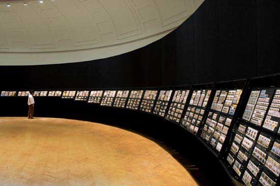
'Stamp Collection - Imaging South Africa' is a project by South African artist Siemon Allen that explores the political history and shifting identity of South Africa through the collection, cataloguing, research and display of postal stamps released in the country from the formation of the Union in 1910 to the present. The exhibition tells the story of the changing face of South Africa, revealing how the country, over time, has chosen to represent itself both within its borders and internationally. It is a fragmented narration that speaks not only through what is shown but also through what is not.
'Stamp Collection' revisits an earlier series from 1993 in which Allen presented what he described as "icons from my middle class youth" - a display of personal possessions re-framed to read as cultural artefacts. These works offered a subtle social critique of the insular nature of postcolonial white South African culture, and included what would become the seeds for this exhibition - his childhood collection of South African stamps.
The exhibition at the Corcoran is an expanded, more comprehensive inventory of over 8 000 specimens, presented within the framework of an architectural installation that operates as a simulated gallery within the existing exhibition space. Shown in a structure built to reference the
display conventions used to present archival documents in historical museums, the stamps behave both as art objects operating through visual pleasure, and as artefacts plucked from South Africa's history.
Each stamp operates not only aesthetically, but also as a vehicle for a very particular subject. For Allen, "it is a kind of public relations gesture - a highly self-conscious attempt to express through a single image some aspect of national identity." He describes 'Stamp Collection' as "a history told in a succession of scenes, in a voice that is constantly relocating with subtle and dramatic shifts in political power".
For Allen, the official message of each stamp carries with it a sub-text and, for him, a critical look at the collection reveals the persistent contradictions that exist between the images presented on the stamps and the social realities of the period in which they were released. In recent releases, these tensions are often subtle. Stamps depicting art shift from European oil paintings and heroic bronzes to "traditional crafts" and, so in some sense, appear to validate "African Art". "But in a rapidly globalised exchange", he points out, " it is an image of African artistic production that is also limited." Workers are celebrated with a set of sunny heroic icons. But for Allen, this is both a positive affirmation of the broadening economic opportunities in the new South Africa and a hopeful assertion in the face of an impatient, underemployed labour force. While the release of a stamp with the image of a beadwork red ribbon pin - the South African symbol for AIDS awareness - operates as a kind of official recognition of the problem, behind this beautiful and modest image is a complex struggle of policy and attitudes.
Despite the international interest in South Africa's political miracle, it remains a place only partially understood through a small number of familiar media images. 'Stamp Collection' is both a look back over time at how South Africa has been "imaged" and a view into lesser known events in or aspects of South African culture and history. A careful look at these artefacts requires a critical eye, for though much is revealed, there is much concealed as well.
Recently the South African Office of Environmental Affairs and Tourism made a public appeal for what it called a positive "branding" of South Africa internationally. This included the recruiting of non-government South Africans living overseas to act as "ambassadors" for the country. For Allen, this direct and official articulation of the need to "image" South Africa echoes the ways in which the stamp's image constructs a national identity. He sees his own presentation of the stamp collection in Washington DC as both a subtle critique and a kind of covert participation with this stated agenda. Allen, who works from a self-described "place of apprehension and contradiction," presents his stamps with the admission that they are "carriers of images that most often mask or remain silent on much that is officially unacknowledged." But the seeming detachment in Allen's almost "scientific" presentation along with his obvious care in the arrangement and display of these "precious artefacts" in some sense denies this critique. Ultimately the exhibition operates with a kind of feigned complicity in the dissemination of the stamps' propagandistic messages.
It is significant that this presentation of 'Stamp Collection - Imaging South Africa' takes place in Washington, in an institution that is itself located across the street from the White House and near to the Smithsonian Museums. The weight of history is evident both in the presence of the numerous national collections, and in the self-consciousness of the city's layout of monuments in the surrounding area. It is an exhibition of stamps from South Africa that addresses through its historical artefacts the South African government's political shifts and its changing image of itself. It is an art exhibition framed first as a "scientific display", framed again by the museum and yet again by the city.
Kendall Buster is Associate Professor of Fine Arts at the Corcoran College of Art and Design in Washington
Until August 13
Corcoran Gallery, Washington DC
| ||||

Sunday Jack Akpan
Tracey Rose
Magnus Wallin
Anri Sala
Do-Ho Suh
Masato Nakamura
Luc Tuymans
Mark Wallinger
|
Welcome to the Pearly Gates: The 49th Venice Biennale
by Emma Bedford The 49th Venice Biennale opened in June to the usual clamorous press previews with 14 000 people a day crowding through the Giardini, the Arsenale and environs. Having negotiated a deal whereby he would curate the central show for the 1999 and 2001 biennales, director Harald Szeemann roused much curiosity as to what he would deliver in his central exhibition. His 'Plateau of Humankind' begins in the Italian Pavilion with what he calls the 'Platform of Thought'. On an enormous pink mound Rodin's Thinker, that paragon of Western Humanism, sits pondering the surrounding figurative sculpture which is, significantly, erotic or, more pointedly, phallic. From Africa there are simplistic painted wooden figures several of which draw attention to the scourge of AIDS, from Asia beautiful Indian temple friezes writhing with copulating figures, and from Europe primitivist sculptures. What can have been his intention? If this is the director's idea of the West contemplating the arrival of artists "from different cultures, which have moved from their exile", as Szeemann puts it in the catalogue, it is an embarrassing and offensive display of the most patronising arrogance and ignorance. It is unfortunately the above tableau that sets the scene for the much-vaunted 'Plateau of Humankind' (formerly Mankind) and not "the positive, utopian spirituality of Beuys" with which he had intended to launch this biennale. Aside from the "African idols" (Szeemann's words) on the 'Platform' the only other artists from Africa are Tracey Rose, Minnette Vári and Sunday Jack Akpan, the latter exhibiting one of his cement sculptures of Nigerian chiefs. The oddly named Sarenco l'Africano turns out not to be African at all but an Italian "art merchant" (amongst other things) who last exhibited in 1972. This only served to heighten the impact of 'Authentic/Ex-centric: Africa in and out of Africa', the exhibition featuring artists from Africa and the African diaspora. As associate curator of that project I can't review it, but can mention the overwhelmingly positive response we received in Venice. As the doors opened on the first day of the press preview the deputy editor of a leading US-based art journal was there to see the show and interview artists, and our press conference the following day was packed to capacity with international journalists. In addition politicians - a minister of culture, the mayor - pledged their support in future. Glowing reviews are beginning to appear internationally (see highlights below). This enthusiastic feedback is essential for the sponsors, in particular, if this project is to continue as it was intended, giving African curators and artists the opportunity to participate in the Venice Biennale on an ongoing basis. From Ron Mueck's five metre high crouching boy at the entrance to the Corderie to Richards Serra's 12 metre wide forged spirals at the end of the Arsenale, the message is clear: not only does size count but it is everything. The sheer scale of the exhibition is overwhelming. Vári's small video piece Mirage, eventually placed at the entrance to the Italian pavilion after a protracted series of setbacks, hardly stands a chance. Her two larger projections, Oracle and REM, fare better in the Arsenale and prove that Africa can deliver work that is complex and draws on cutting-edge technology. (See June News.) Similarly Tracey Rose's three-screen projection not only holds its own in terms of scale but its beauty, humour and technical innovation ensure that it shines among many indifferent videos from the world's richest nations. In contrast to the apparent simplicity of her earlier TKO, this ambitious work is a tour de force. Entitled Ciao Bella, like the famous Italian song, it presents a table akin to that of the Last Supper surrounded by characters all played by Rose herself. Each is astonishingly transformed in costumes made by the artist, whether a mermaid's tail from bubble wrap or a Marie Antoinette in fabulous décolletage fashioned from bin liners. From the demure schoolgirl, to the deliciously leather-clad La Cicciolina exposing and flagellating herself, to Saartjie Baartman, made whole again from her dismembered parts in the Musée de l'Homme and here seen ascending to heaven, Rose has gathered the stereotypes of women from history and revels in these many guises. But the boxer catatonically beating herself up with alternate black and white gloves while intoning "Love me. Fuck me. Love me. Fuck me" gives the lie to any of these women who might have imagined that they are free from the bonds of sexism, racism and a broader global oppression whose ranking order is as ruthless as it ever was. And all this is interspersed with the delicate strains of Panis Angelicus, making the work as beautiful and funny as it is hard-hitting. While the work could have benefited perhaps from more rigorous editing it is undoubtedly a major work in her oeuvre. In the opinion of Dan Cameron, senior curator at the New Museum of Contemporary Art in New York, it is one of "the most exciting installations by young artists" at the Biennale (read his diary on www.artforum.com). Given the broad theme of humanity it wasn't surprising that numerous works explored historical, social and political issues. Many were powerful, stark and moving but none so beautiful as Yervant Gianikian and Angela Ricci Lucchi's films. The March of Man utilises ethnographic footage slowed down to a majestic pace, overlaid with splendid colour and punctuated with penetrating texts. The robed and turbaned figures moving slowly across a sepia ground on the first screen are drawn from an 1895 film entitled Homme Negre: Marche. The text reads: "The great scientific and human hopes in knowledge". The footage on the second blazing red screen is drawn from a 1910 film showing a great white bwana shooting a pelican and then pushing a cowering black man into the water to collect his bounty. Other scenes show groups of black men semi-naked but sporting top hats. The text: "Is he passive? Is he suffering? What does he feel? Is he compliant? How long will he be submissive?" The final searing yellow screen shows 1960s footage of a man handing a token to Ndebele maidens whose offended expressions indicate their distaste. The text: "The subject is considered insensitive, studied like an insect, sexually available". Projected on three screens one after the other they force one to walk at a slow pace through them and consider one's own movement through and complicity in these kinds of scenarios. Ken Lum's posters against xenophobia are immediate and arresting in contrast to Stan Douglas' haunting double projection of a black woman searching a dark house with a torch as if returning to a scene of some terrible trauma. Other impressive videos included Magnus Wallin's terrifying images of stunted humans struggling in urban nightmares and Chris Cunningham's explorations of auto-eroticism, desire and brutality, as compulsive as they were nauseating, but always full of eager watchers. By contrast the modest monochromatic work of Anri Sala, born in Albania and living in France, is poignant. Uomoduomo presents an impoverished old man asleep on a cathedral pew. With extreme economy of means this solitary figure encapsulates the urban terror of superannuity, garnering for Sala one of the Special Awards for Young Artists. There were pockets of welcome relief from the predominance of video such as Do-Ho Suh's glass floor supported by thousands of tiny men and women fashioned in fine social realist style. Likewise outside the Korean pavilion his colossal empty plinth supported by minute figures was a powerful (and humorous) comment on the subjugation of the individual to the collective. Also highlighting the power of the state was A1-53167, the nom de guerre of a Guatemalan artist who needs to protect his identity. He displayed a series of small photographs documenting his guerrilla tactics. Under cover of darkness he deposits charcoal on the roads on the eve of significant military parades. With its associations of burnt land and razed towns, the charcoal is trampled underfoot by the militia who spread the evidence of their complicity in these acts throughout the city. In contrast an amusing approach was offered by Francis Alÿs who in his absence chose to be represented by strutting peacocks, encapsulating so much of the puffed-up pretensions of art stars one encountered daily in Venice. Thanks to Cai Guo-Qiang, Rikrit Tiravanija and others the exhausted visitor emerging at the end of the Arsenale can relax in the shade of a refreshment station overlooking the open sea while waiting for the shuttle boat to take one to the Giardini di Castelli where the national pavilions are located. That Szeemann's show failed to live up to expectations was confirmed when Frieze magazine's first SMS hot tip to subscribers on the opening day advised visitors to queue for the Canadian and German pavilions and to see Africa (in the show 'Authentic/Ex-centric'). This was corroborated when all three were amongst the prizewinners. In the Canadian pavilion Janet Cardiff and Georges Bures Miller offer visitors a cinematic journey saturated in sensual stimulation, which blurs the distinctions between fiction and reality. The Golden Lion for best exhibition in a National Pavilion was awarded to the German pavilion. Gregor Schneider managed to transform this epitome of Third Reich architecture into a discomforting warren of claustrophobic rooms and dead-end passages. Yinka Shonibare won a mention for Vacation on 'Authentic/Ex-centric'. The installation presents an imagined nuclear family, clad in African-print space suits, colonising the moon. Pierre Huyghe in the French pavilion was the deserved winner of a Special Award for his video projections and participatory digital media that are as astonishing for their technical virtuosity as they are for their scale of production. In the Japanese pavilion Masato Nakamura captured in exquisite style both the seduction and the awful inevitability of globalisation through the repetition of yellow M-forms akin to those of McDonald's. Belgium presents a brave examination of its own colonial history through the medium of Luc Tuyman's paintings of Patrice Lumumba, allegedly murdered by Belgian agents soon after independence. The harsh white light of the pavilion washes out the pale paintings as if this history were threatened by denial or indifference. And at the end of the Giardini's broad leafy avenue Mark Wallinger welcomed visitors to the British pavilion by erecting an Irish flag in front of it, typical of his unique and iconoclastic sense of humour. Within the pavilion works rich in biblical allusions include Threshold to the Kingdom, a video projection. To the rousing soundtrack of Allegri's choral Miserere weary disoriented travelers emerge through the doors at International Arrivals as if they were confused souls arriving at the "pearly gates". For anyone who has ever had to stand in those interminably long non-European Union queues, the experience of being excluded from "the Promised Land" is very real. As Kim Levin says in her incisive review, "The demographics of the biennale ... are as myopic as ever ..." (see "Panic Attack", June 25 2001 at www.villagevoice.com). I can't help wondering if it isn't going to be easier for a camel to get through the eye of a needle than it will be for artists from Africa (in significant numbers) to breach the gates of the Giardini di Castelli. Emma Bedford is a curator at the South African National Gallery and was associate curator of 'Authentic/Ex-centric: Africa in and out of Africa'
| ||||

Berni Searle
Willem Boshoff
|
'Authentic/Ex-centric' - praise from the world press
Lynn Macritchie, "Out of Africa into the limelight" "This year, the Palazzo Fondazione Levi in San Marco houses 'Authentic/Ex-centric', a group show of seven artists from Africa. ... The black South African artist Berni Searle in her video installation, Snow White, makes a simple point clearly and well. As she kneels naked on the ground, her black skin appears to turn white as it is dusted by white flour poured over her head. It gleams black again as a stream of water follows the flour, washing it from her skin. Scooping the fallen flour and water into her hands, she kneads them into dough to make flat bread, a process she learned from her mother. "Also using the metaphor of bread is white South African artist Willem Boshoff in his installation, Panifice. In the inner courtyard of the Conservatorio di Musica near the palazzo, Boshoff has laid out on the ground a circle of 'loaves' made of granite, each on its own granite 'breadboard'. Each breadboard is inscribed in a different language, African or European, with the Biblical quotation 'What man is there of you, whom if his son ask bread, will give him a stone?' Reading these ever-varying words with the sounds of the voices and instruments of the music students at their practice floating down between the dark, crenellated walls of this usually inaccessible space is one of this Biennale's more delicious moments."
Kim Levin, "Panic Attack: Navigating the Venice Biennale's Sprawling Interzone", Village Voice, June 25 2001
Coco Fusco, "When in Rome (or Venice)"
Christine Temin, Boston Globe, July 1 2001
| ||||

Willem Boshoff
Willem Boshoff
Berni Searle
Berni Searle
Maria Magdalena Campos-Pons
Yinka Shonibare
Yinka Shonibare
Godfried Donkor
Rachid Koraïchi
Zineb Sedira
|
'Authentic/Ex-centric' at the Venice Biennale
by Nic Dawes The 49th Venice Biennale presents itself under the title 'Plateau of Humankind'. Biennale czar Harald Szeemann evidently has a thoroughly anthropological idea of art. That is to say, he believes humanity finds itself in art, a pose of gentle naivete that has a long and unattractive history in Western art history. It is perhaps not surprising, then, that Africa finds itself once again literally on the sidelines, confined to the Biennale's 'A latera' section for exhibitions that cannot find room at Mr Szeemann's high table. That this is an improvement over past years is probably explanation enough for the fact that the curators of 'Authentic/Ex-centric: Africa in and out of Africa' exert themselves so strenuously in the effort to claim a legitimate contemporaneity for African artists "working within a conceptual mode". The anxiety is understandable, but the strain is evident in a show that addresses the limits its title remarks on in only the most occasional way. In a courtyard of the Conservatorio di Musica, Willem Boshoff has distributed some 20 rough-hewn loaves of pink granite. Each one rests on a highly polished breadboard of Zimbabwe black granite, and bears an engraved inscription from the gospel of Matthew: "And what man among you, when his son asks for bread, would give him a stone". The phrase is rendered in a different language on each board, along with an enumeration of the places in which the language is spoken, and the remaining speakers. In the anthropological fantasy of the Biennale catalogue the installation speaks to our "common humanity", the ritual of breaking bread, the translatability of languages, and the fullness of human speech. However, in the bright glare of a Venetian noon, resting on worn blocks of Istrian stone, the glossy black breadboards with their perfectly unbreakable loaves resemble nothing so much as funerary monuments, histories of the illusion on which the plateau of humanity supports itself. Boshoff's installation points downward to the decaying wooden piles and shifting mud on which the Academia rests, rather than upward to its ornate capitals and light-filled rooms. Boshoff's work regularly makes itself available as an exhibit in trial of dominant and subordinate languages, epistemologies or peoples and it often displays a kind of pseudo-erudition that seems calculated to lend some mystical authority to the case he is making. With Panifice, in contrast, the artist has resisted the temptation to order the elements of the work in binary pairs of any kind. As a result the installation does not exhaust itself in the pathos of mourning or the flatness of argumentation. The granite lumps are too big to serve as grist for the dialectico-conceptual mill; at once shiny and dull, rough and smooth, they anchor Boshoff's field of linguistic and textual references, but their stubborn material insistence is tough to slice through, no matter how much you sharpen the contradictions. Would that the same could be said of Berni Searle's Snow White. Indeed, as one stands poised between the two screens that comprise the video installation, a single question imposes itself: "And who among you, when the public asks for something to chew on, would give them a video of Berni Searle making roti?" The loop begins with Searle naked and kneeling in a pool of light. Fine white flour sifts from above, slowly turning her white - a domestic Pentecost. After some time she begins to shake the flour off her limbs and water trickles from above, washing her skin back to brown. Searle now sweeps all the flour together and begins to knead it into a rough loaf of smooth, elastic dough. This sequence plays out on two opposed screens, one providing a level view and the other an oblique top-shot. The action is slightly out of phase so that you can turn between two subject positions. This sets up a kind of disjunctive time that fools the spectator into thinking it might be possible to look into the future, or occupy both elevated and level positions at once, but in the end leaves you acutely aware of the fact that this simultaneity is impossible. Or rather this is the effect that would be achieved if you cared about what you were looking at. Instead one simply sighs in affirmation: indeed race, gender and domestic labour cut across the body of the black but not-quite-black woman in complicated ways. Indeed woman's work has a transformative and even sacramental character, but how tedious the lecture, how dully the point is inscribed on tape, and how easily we could have read it in a book, mirror on the wall, wicked queen and all. The perfectly banal surface of identity politics, of a comfortable academic discourse on hybridity, smoothes everything over here. In the end we are standing in front of yet another video of a naked woman performing a repetitive task, and we are bored beyond words. Maria Magdalena Campos-Pons' multimedia monument to the labour of mothers - a voodoo invocation through tombstone ironing boards, votary resin irons, and video projections - is more wrought than Searle's piece, but if anything its energy is more dissipated. The exception is a video trompe l'oeil in which a needle seems to embroider the folded linen onto which it is projected. This small corner of the installation has a delicately elegiac beauty which is somehow lost when one turns to the major elements of the piece. What we are faced with is another invocation of the dignity of maternal labour which leaves no complexity and no abjection unrecuperated. The result is sentimentalism, even if it is sentimentalism with a richer than usual field of reference. Yinka Shonibare has been playing with multiple meanings of wax print fabrics for more than six years now. He has created tableware, wax print high heels, and a race of alien beings from the patterned cloth that ordinarily clothes the sartorially Afrocentric from Lagos to Laguna beach and points beyond. In some respects the joke should be played out. Anyone who is familiar with Shonibare's work knows that the fabric is in fact not African, but Dutch and English. The nationalist politicians and African-American roots tourists who have adopted these fabrics as a mark of pride are implicating themselves in the history of the colonial textile trade rather than making an uncomplicated reference to their African heritage. Like all the best jokes this one cuts both ways - and Shonibare manages to make it continually productive. Mr and Mrs Andrews Without Their Heads - for which Shonibare created an immaculately tailored and headless reproduction of the Gainsborough painting - is a particularly good example. For the Biennale he has installed a family of tourists in immaculate wax print space suits and dark, glossy Perspex visors on a floating platform in a dark room. It's a nuclear family glowing gently in the dark: two parents and two children, rendered raceless and sexless by the bulky suits and the impassive black glass of their helmets, are frozen in exploration or play. The effect is properly speaking uncanny, a set of familiar poses and references frozen into an utterly strange tableau. The work references psychoanalysis, anthropology, trade, tourism, tableaux vivants and science fiction, but it estranges all of them to leave behind an odd, embarrassed fear that resonates just beyond the edge of the available generic categories. Godfried Donkor's rather more obvious historiography plays itself out next door in the site-specific Lord Byron's Drawing Room. Donkor is busy reconstructing the lost history of the 18th century by creating seamless digital collages out of illustrations sourced from the British Museum. In this installation he imagines Lord Byron's Venetian drawing room decorated with digital prints on canvas that illustrate black protagonists' part in the entertainments of a fashionable young Englishman (we are reminded of Shonibare's Diary of a Victorian Dandy photographs). We are presented with black and white pugilists facing off, black saloon patrons and a London mob at least as racially mixed as any you are likely to see in a newspaper photograph today. Donkor's work is part visual excavation, part historical speculation, and part Photoshop fabulation. The prints have a flat, museum display quality which fails to completely suppress the graphic energy of the work, but nonetheless ensures that it achieves its success primarily at a narrative level. The narrative arc of Rachid Koraïchi's Chemin des Roses, which occupies the long and light-filled central gallery through which the other installations are reached, is far more simple, to the extent that it is accessible to a non-Islamic audience at all. A row of Arabic glyphs etched out of steel marches toward the casement windows and the Grand Canal, the walls are lined with gold embroidered cloths, and the air is thick with the scent of the rose petals that float in densely inscribed ablution bowls. The piece alludes to Safahr, the Sufi journey to enlightenment, and the decorative surfaces which dominate the room speak to the task of writing, repetition and trance in achieving that state. The piece inserts itself and its audience on a trajectory toward a specifically religious transcendence which it is difficult to engage without debating the place of mysticism in contemporary art. Is there a place for what is essentially a mystic praxis in an exhibition dedicated to African conceptualism? And would a Catholic mysticism be similarly licensed? These are not completely trivial questions, and without them Koraïchi's work rapidly devolves into pure exotic decoration. Zineb Sedira engages with the decorative tradition of Islam in quite a different way. Her Quatre générations des femmes is a set of walls covered floor to ceiling by computer generated patterns on tiles. Sedira repositions the prohibition on representation in Islam by introducing photographs of four generations of women as elements of the pattern and repeating them ad infinitum in a determined mathematical transformation. It is as if the vague affirmation of Campos-Pons' piece had been given a thorough and rigorous working over, forced through the Islamic decorative mode into a far more productive and compelling performance of the space between religion, gender, and artistic discourse. The accompanying video piece Don't do to her what you did to me attempts to achieve the same transformation: a woman's hands inscribe the title on photographs of a young girl. The photographs are dropped into a bowl of water, the ink spreading out like smoke. The emulsion slowly dissolves and finally the solution is swallowed - a charm against evil. The urgency of the ritual, its secrecy and power are somehow lost in the dilatory time of video; where Quatre générations des femmes has the force of synchrony, the unfolding of the video as narrative dilutes the concept rather than complicating it, but Sedira is hardly alone in this. The 49th Biennale is padded out with acres of stunningly mediocre video work. No doubt there is room for debate on the selection criteria for 'Authentic/Ex-centric'. Some of the artists - notably Shonibare - have provided work that explicitly folds the limits of Africa and Africanness back on themselves; others seem to be present simply as representatives of the fact that there is an African Diaspora. Perhaps it is a mark of the curators' need to stake a claim - any claim - in the mud of Venice that the conceptual framework of the exhibition is so casually dealt with, but it is disappointing nonetheless. Harald Szeemann has told the art world that the next instalment of the Biennale will be African in the same sense that 1999 was Chinese and 2001 Finnish. These are words to strike fear into our hearts, but however ludicrous the animating intention, 2003 may represent an opportunity to create an African presence that has more to do with the work and less to do with shoring up its claims to legitimacy. Nick Dawes is a Cape Town based writer on culture who currently heads up the new media company Maverick Interface Design Until November 4
Palazzo Fondazione Levi, San Marco 2893, 30124 Venezia
| ||||

William Kentridge
William Kentridge
William Kentridge
William Kentridge
William Kentridge
|
Mainstream America meets William Kentridge
by Laurie Farrell In the past four years, William Kentridge's work has received considerable exposure and acclaim in the United States. Sue Williamson summed up Kentridge's trajectory when she observed that 12 years ago, Kentridge walked around New York City trying to persuade art galleries to look at his slides without success. Things have changed considerably. In 1998, Kentridge held solo exhibitions including 'Drawings for Projection' at the Drawing Center, New York, and 'Weighing and Wanting' at MCA San Diego, and was a finalist in the Hugo Boss Prize Exhibition at the SoHo branch of the Solomon R Guggenheim Museum, New York. Add to that the 1999/2000 Carnegie International Medal and a coveted slot in the MoMA New York Projects series (both of these exhibitions featured his film Stereoscope), and one could argue that the American art scene should know who William Kentridge is. Curated by Neal Benezra, deputy director and curator at the Art Institute of Chicago; Staci Boris, associate curator at the Museum of Contemporary Art, Chicago; and Dan Cameron, senior curator at the New Museum of Contemporary Art, New York, this retrospective stops at major metropolitan museums across the States and ends at the South African National Gallery in Cape Town. On February 28 2001, Kentridge's first major retrospective opened at the Hirshhorn Museum and Sculpture Garden at the Smithsonian Institution in the nation's capital. With high ceilings, a clean installation, curving walls that helped the exhibition's narrative unfold, and an enormous space that seemed to have been created for this show, this opening installation really set the pace for what is sure to be a very successful tour. The exhibition included 11 films, excerpts from theatre productions, two film installations, line drawings created by the artist for this venue, and more than 70 graphic works. One of the strengths of this exhibition is the connection between Kentridge's drawings and the films they appear in. In the exhibition walkthrough, drawings were grouped in series according to the film they relate to, and preceded their respective films. Experiencing drawings created for a film, and then watching the life of the print evolve through various stages of erasure and transition into film, created an organic bond between the drawings and films. After walking through several series of drawings followed by films, visitors were able to visually obtain familiarity with Kentridge's process, cast of characters, and an underlying sense of his artistic style. The Kentridge show is currently on view at the New Museum of Contemporary Art in New York City. Senior curator Dan Cameron gave a press tour on opening day that introduced the New York adaptation of the exhibition. The New York exhibition opens with Shadow Procession (1999), a seven minute film with music by Alfred Makgalemele that creates a liminal space between the ticket booth and the entry space of the exhibition. Turning the corner into a small room, a series of eight etchings from the Hogarth in Johannesburg series (1986-7) along with three other graphic works serve as representations of Kentridge's early period. Moving further into the show, the next space includes several series of drawings from Kentridge's first eight films that are screening continuously in one room in the back of the gallery. After watching over 60 minutes of film, the visitor must double back through the exhibition in order to continue on to the upper levels. Heading back towards the front of the gallery space, an intimate side gallery contains Medicine Chest (2000). This new installation piece projects through a small chest that has two glass shelves and a clear glass door as its vehicle of transmission. Accompanied by a soundtrack in DC, the piece is showing mute in New York City due to the artist's desire to avoid audio bleeds from other spaces. Ascending the stairs to the mezzanine level, a series of three 1988 silkscreen prints on paper titled Art in a State of Grace, Art in a State of Hope and Art in a State of Siege are installed in a curious space above the front desk. Kentridge stated that these prints are the most politically motivated works in the show. Located in an open walkway between the two main exhibition floors, excerpts from three theatre productions, namely Faustus in Africa! (1995), Ubu and the Truth Commission (1997) and the Monteverdi opera Il Ritorno d'Ulisse (1998) play on a single monitor as people traverse back and forth. As an open critique, it is interesting to note that the theatre installations at the Hirshhorn and the New Museum both placed these three works in walkways. In defense of both curatorial programmes, all institutions must address spatial constraints and make choices. It is interesting that these works which highlight collaborations between Kentridge and the talented Handspring Puppet Company are consistently placed in challenging spaces. The top and final floor of the New Museum installation houses three separate viewing spaces for Ulisse: ECHO scan slide bottle (1998), the projection installation Sleeping on Glass (1999), and Ubu Tells the Truth (1997). Additional graphic works line the walls connecting the closed viewing spaces, allowing the drawings and prints to stand on their own. Initially, after comparing the DC and New Museum installations, I felt that the strong connection between the drawings and prints that had been so effectively translated in DC was lost in the New Museum adaptation. However, after careful reconsideration, I recognised that Cameron's installation allows Kentridge's strength in each media to shine through. Also, Kentridge states that initially he felt the drawings were the art and were to be kept separate from the films. And sure, it is a lot to ask the average museum visitor to sit through eight films in one sitting. But you can be sure that the individuals who actually do so will walk away with an ability to connect characters, themes and reoccurring icons (both the obvious and the esoteric). A noted commonality in both installations was the absence of extended label copy and timelines that tend to historically anchor artists. By abandoning over-simplified, "didactic" text, the curators have allowed visitors to experience common themes imbedded in Kentridge's work: issues of loyalty and loneliness, action and introspection, the teasing out of corrupt power structures, and larger human issues that seem rooted and local in almost every context. Furthermore, avoiding a directing narrative allows each viewer to find their own respective truths and connections with the art. Visitors who want to feed additional intellectual curiosities can do so by purchasing the exhibition catalogue, a William Kentridge: Drawing the Passing video, or David Krut's William Kentridge CD-ROM (all which are valuable resources and recommended purchases). Another opportunity for information was made available at the New Museum through a public conversation held between Dan Cameron and William Kentridge. In an open interview that encouraged questions from the public, Kentridge revealed sources and ideas that have motivated his works. Carefully evading several audience members' attempts to categorise his artistic expressions as products of his Jewish heritage, or sympathies of white-guilt in post-apartheid South Africa, Kentridge articulated the complexities surrounding the weight of Europe in Africa. Laurie Ann Farrell is associate curator at the Museum for African Art, New York The New Museum exhibition closes on September 16 2001, then travels to the following venues:
Museum of Contemporary Art, Chicago
Contemporary Arts Museum, Houston
Los Angeles County Museum of Art, Los Angeles
South African National Gallery, Cape Town
| ||||

The cover of Taxi-003
Jeremy Wafer
Jeremy Wafer
|
Taxi-003 Jeremy Wafer
The Taxi series of books on South African artists is beginning to expand: Jeremy Wafer now follows Wayne Barker, Jo Ractliffe and Samson Mudzunga as the subject of focus. Often better known for his lean and minimalist sculptures, Wafer has also regularly worked in two-dimensions with drawing, architectural blueprints, photographs and digitally manipulated images that tend to elude easy interpretation. It is to this elusiveness that Lola Frost, the author of this volume, applies her attention.
Moving chronologically from the more generalised architectonic fragments, with their references to domes, power stations and hostels, that characterised Wafer's earlier work, to the more overtly Africanised Red Ovals (1998), Border (1998) and Stones (2001), Frost's text plunges the reader straight into complex terrain with little introduction. Characterising Wafer's work as formalised in "system, order and repetition", she soon makes it apparent that Wafer plays with a much greater range of concerns than modernism's minimalist articulation of seriality and materials for their own sake.
Frost alerts the reader to Wafer's social, cultural and political concerns, bringing some fine analysis to the work. The termite mound photographs, for instance, analysed in relation to Ovals and Border, are seen to reveal nature, community and culture. Here borders, in the post-colonial context, become not containers but portals - arenas of transformation. Criticised by some as over-politicising the work, Frost in fact reveals some previously neglected conceptual underpinnings of the work that Wafer, in conversation, is happy to confirm.
Like the other Taxi books, this offering can be read at a sitting and is designed to somehow reflect the artist's oeuvre. Here the images sit leanly on the page with few fancy graphic tricks to distract the reader's eye. The annotation of the images is, however, a little too sparse, giving the title and date of the work but no media or scale. In addition, while some of the images are repeated to support reiteration in the text, in their second incarnation they often lack any annotation at all. The lack of an index does not help. And while Wafer's architectural work is referenced pictorially later in the book (in the French and Dutch sections), there is no written contextualisation of what is becoming an increasingly important aspect of his work.
A problem with the series seems to present itself in terms of situating its readership. Endeavouring to answer the needs of a severely underfed local academic discourse, yet at the same time attempting to provide an introduction to a broader audience, it sometimes falls between two stools. Frost's text at times verges on the obtuse - her language and often convoluted and elliptical form of writing may well daunt the less academic reader.
The educational supplement itself (no longer an optional extra, making the complete package R194) is well considered. Written by Philippa Hobbs, it provides fact files, discussion points, research and writing projects as well as practical assignments to help young artists engage with their world. Supported by images of references that inform Wafer's work such as the amasumpa or "wart-like" designs that occur on traditional pots in the KwaZulu-Natal area, or the scarification marks on skin so often used to create symbolic codes on the bodies of initiates in Africa, the presentation is accessible and stimulating. The only unfortunate element here is the same lack of reference to scale as in the main text and the inclusion, on the final page, of a completely untitled example of one of Wafer's recent manipulations of heraldry which is never explained and is confusingly placed directly above the crest of one of the sponsors for the project.
Despite this, Taxi-003 is another very welcome addition to the writings on contemporary artists in this country.
See ArtThrob Reviews June 2001 for reviews of Taxi-001 Jo Ractliffe and Taxi-002 Samson Mudzunga
|